

At Center Street Digital we use mobile responsive Wordpress themes to build your small business website. This means that your site adapts to whatever device screen size (phone, tablet, laptop) your potential customer is using, which allows for a seamless experience.
Let’s get all philosophical for a moment.
Your website content is like water.
“You put water in into a cup and it becomes the cup. Put water into a bottle and it becomes the bottle. You put it in the teapot and it become the teapot.” – Bruce Lee
The goal is that your customers can easily find what they need on your site from any device at any time with the least amount of panning, scrolling, zooming, etc..
This is especially important for storefront businesses that depend on localized search for business leads. A huge amount of people are researching local businesses from their phone before they visit.
Don’t get penalized by Google.
More and more Google is including “user experience” when ranking websites in organic search. The more your browsers have a good experience and find the content they’re looking for the higher the rankings.
We think that’s a good thing.
Among other things (page load speed, broken links, etc.) Google uses mobile responsiveness to rate a website for Search Engine Optimization (SEO). Starting back in 2015 Google announced that it will penalize sites that don’t have mobile friendly functionality.
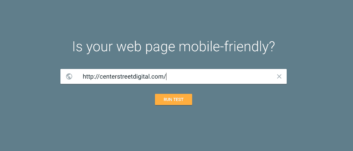
Take action right now and test your site here to see how mobile friendly it is.
The good news is that your options for a new small business website, that is mobile-friendly, are almost endless. If you’re serious about removing all the barriers that are keeping people from finding you online, generating more lead and growing your business online now is the time to make a change.