Just remember that your website is your online storefront and despite what your parents told you, people do judge a book by it’s cover.
It’s cold and rainy (at least here in Portland) and that means it’s time to hunker down and do some maintenance on your small business website right? Here are a few design and digital marketing tips (taking into account recent trends) that will help your site be effective in growing your business.
Keep it simple
The biggest mistake we see people make in small business website design is their front page is too dang confusing. The human brain wants simplicity and wants to know what it should do next. The front page should tell about your product or service succinctly with quality images and text. Avoid the propensity to show off everything you do at once.
The average person will spend about 10-20 seconds on your website, so your goal is to make it as clear as possible what you do and what the browser needs to to in order to take advantage of your product or service.
Update contact information for search marketing
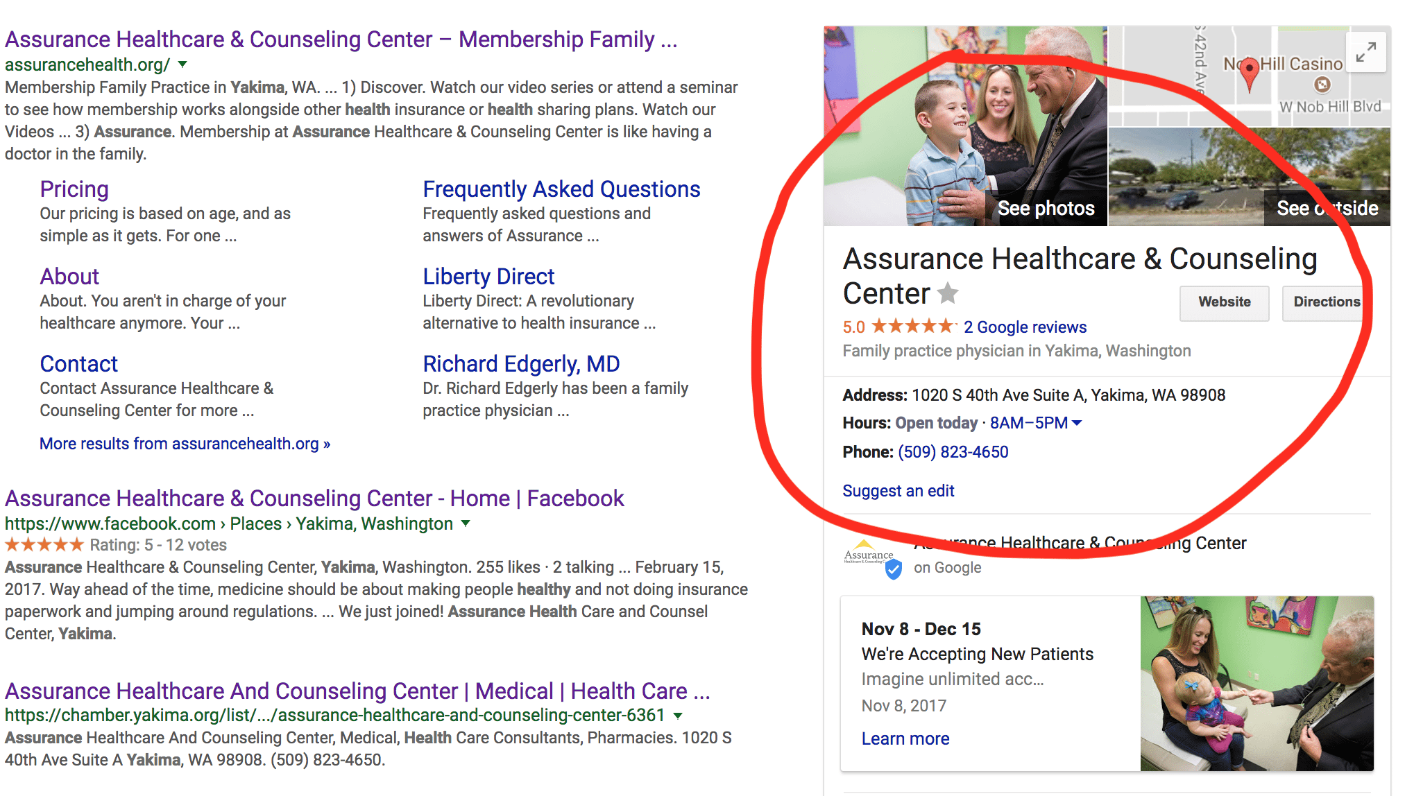
Search marketing is becoming a key strategy for small businesses. With the rise of no-click lead generation, ie., those people who find you in google search and call or get directions without visiting your website, having accurate information is a non-negotiable.
Also, having your contact info on your front page allows Google to capture that information easier and display it in local search results like the following image. If you want to take it to the next level and get technical, you can explore Google Search Console’s date highlighter functionality to make sure this is happening for your contact info.

Above-the-fold CTA
You should have a clear call to action and have it above the fold. The browser shouldn’t have to scroll to find the button that helps them take their next step with your product or service (call now, buy now, contact us, register now). Having a key call-to-action front and center on your site also helps communicate what you’re all about and what the browser can expect from you.
Keep in mind, however, people still scroll, they just pay less attention to content displayed lower. We recommend having an additional call to action button on the bottom of your front page too.
Our friends at Johnson’s get an incredible amount of leads from this simple above the fold section of their front page.

Simplify your navigation bar
There is no need to put a link to every page on your website in the top navigation bar on your homepage. Simple is better and makes for a better user experience. A browser wants to know who you are (if you’re trustworthy and credible), what you offer and how to take advantage of your product or service.
Keep in mind for most storefront businesses a large portion of your browsers will be on mobile. They aren’t visiting your site for prolonged research and browsing, they’re looking for utility. Also, be mindful that links close together or stacked are tough for thumbs to click on.
Get current
Your broken links, cheesy images, and outdated About page text probably isn’t communicating what you want to your potential customers. A little maintenance goes a long way. Take some time to add fresh images to your site. Click on every link to make sure they work and update the text on your site with current information or better writing!
The bottom line is that your small business website should leave a good impression with the browser and at the same time be effective in generating leads that helps grow your business. Take some time to do some simple maintenance to help your website provide value to those that want to find you!

